
Moms 1: How We Got Here
My first entry in a collaboration with MomsRising

Preamble: A new collab!
I’ve kicked off a new collaboration with MomsRising, a grassroots organization that brings moms’ voices to national conversations. They are doing a campaign to encourage moms to post about their cost of living and their budget struggles in order to bring attention to the economic need of families.
As part of that, I’m writing a monthly explainer column to accompany their work to bring the backstory and context to what’s going on today. You can find the campaign site and post via their website, but I’ve also expanded on it here for the Kedits subscribers with a little bit more data:
A decent life
Affordability is a two-way street
Runaway prices…
Meet uneven wages
Putting it together
But What About…[politician/political party I don’t like]?
A decent life
Why does it feel like it is so hard to afford a decent life? Not decadent, not luxurious, just decent. And why does it seem like it used to be easier to afford that decent life? There is a very straightforward explanation that answers both of these questions. An economist would say, it comes down to the ‘relative growth in prices and wages.’
So what does that mean?
My name is Kathryn Anne Edwards. I’m a PhD labor economist. I used to work at a research institute in what was mostly a steady and predictable 9-5 job. But after I had two kids during the pandemic, I found even steady and predictable was too much for me to manage. I quit and started my own business so I could have more control over my schedule. I had to give up a lot of what I worked on in my career, but I gained a lot of freedom and room to be creative. I built up a client list and embarked on becoming a social media influencer, explaining the economy one video and tweet at a time. I’m now a columnist for a national publication, have a quarter of a million followers across TikTok and Instagram, and started my own podcast Optimist Economy.
Our lives have to change after we have kids, and we don’t know how it will change us and what that will bring. It helped me find my voice in bringing explanation and clarity to the issues Americans want—and deserve—to understand.
Politicians, pundits, talking heads—they aren’t so good at cause and effect because they have an agenda. They talk about the economy in a way to get you to agree with them. I talk about the economy in a way to get you to understand. My agenda is for you to be informed. Economics is hard and complicated, but we all live and depend on this economy, which means we all have the right to understand what’s going on.
Starting with: Relative growth in prices and wages.
Affordability is a two-way street
The idea of something being cheap or expensive isn’t just about its price, but its price relative to your earnings. Is $100 for a dinner cheap? Depends. It’s cheap if you make $250,000 in a year, but it’s expensive if you make $25,000. If something is hard for you to afford, it’s a function of both how much it costs and how much you have.
The question about affording a decent life is big—it’s not just dinner, but all the things that comprise a decent life, from things you need to have to things you feel you ought to have—but it comes down to the same concept of how much it costs (price) and how much you have (earnings).
On paper at least, Americans are richer than they used to be.
It’s easiest to see this over long periods. In 1973, the average hourly wage in the U.S. was $3.90 and by 2024 it was $34.27. That’s a 778% increase over those forty years! Prices were growing too, 607% over the same time. Put them together and you get average real wage growth—the growth in wages net of the growth in prices—of 48%. Put differently: If you look at the average wage and average price, a typical hour of earnings in the U.S. today should be able to buy much more than that same hour of earnings would have been able to buy in 1973.
Instead, it feels like it’s getting harder to afford things, rather than easier.
So, what’s going wrong?
Runaway Prices…
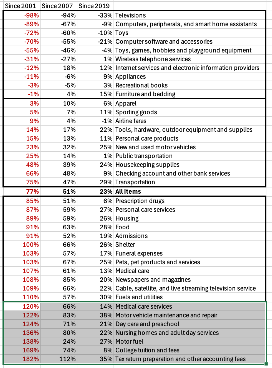
A big part of what’s going wrong is that not all prices grow at the same pace as the average. In the table below, I take a set of goods and services and arrange them by whether their price is growing slower or faster than prices overall since 2001. This data goes through 2024, the last year of annual data; you can think of this as the ‘origin story’ for the bad situation we’re in today.
The first two columns list out things with slower than average price growth and the right two columns list out things with faster growth. I’ve highlighted in red what I think are some key goods. (For exact percentages, see the postscript.)
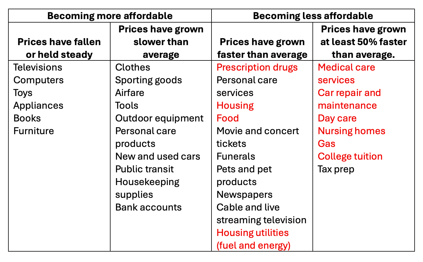
Source: Bureau of Labor Statistics
Consumer goods—think of this as what you could bring home from a Target or Best Buy run—have become relatively cheaper over the past 25 years because their prices have been rising slower than average. In fact, some have fallen outright.
Necessities, on the other hand—housing, food, utilities, prescription drugs, health care, child care, elder care, higher education, gas—have gotten relatively more expensive because their prices have been rising faster than average.
In sum: It’s getting easier to afford non-essential stuff as it’s getting harder to afford the essentials, the hallmarks of a decent life.
In the grand scheme of things, most of us live in some kind of modern luxury of consumer goods, but struggle with the basics. We have the comfort of a refrigerator, TV, car, microwave, all the furniture wanted or needed inside and out, a closet full of clothes, a smartphone, and whatever music, movies, or tv show on demand. And yet it can feel like we are living on the brink.
We can afford things that aren’t needed and struggle to afford things we need like childcare and healthcare. Frankly, it’s exactly what the relative growth in prices would predict. And that’s only half the problem.
…Meet Uneven Wages
High prices, even for the necessities, aren’t a problem if wage growth still outpaces them. For instance, the cost of college tuition has increased 169% since 2001. That’s a problem if wages only grew 100% over the same period, but an inconvenience if wages grew 200%.
Much like prices of different goods and services growing at an uneven rate, wages also have not grown at an even rate
I said earlier that since 1973, the average wage in the US grew 778%. But those gains weren’t steady over those 50 years, nor were they shared. Not all workers saw their wage grow at the same pace as the average did. In fact, most didn’t.
If you were to line up every wage earner in the U.S., rank them from lowest to highest earning, and divide them into ten equal size groups, the cutoffs between the groups are called the ‘decile cutoffs.’ The US has 161 million workers today, so the ten groups would each have about 16 million people in them.
So here’s how wages did. In the left column I show growth since 1973, and in the right I show growth since 2001.
(Why both? Well, the story of wage inequality definitely starts in the 1970s and takes off in the 1980s. I want to show that. But the price data doesn’t get detailed until the 90s so I want to 1) show you to full story but 2) also give you the right window for price comparisons).
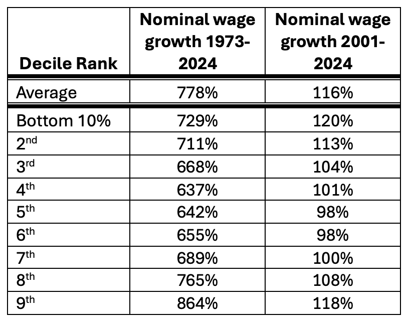
Source: Economic Policy Institute data library
Every wage group except for the top 10% grew slower than average since 1973, but the slowest growth was seen in the middle—the 4th, 5th, and 6th deciles. The very bottom group did better since 2001, but the middle is still moving slowest.
Granted, all of these wages were still higher than average prices, but you’re starting to see the problem: if middle wages grow slower than average wages and the price of say, health care, grows faster than average prices, a hallmark of a decent life gets harder and harder for the middle.
In the next table, I give a summary of U.S. hourly wages in 2024. The table shows the average across all workers (in the first row) and then the decile cutoffs (in the next rows). For example in the second row of the table, the lowest 10% of earners are those 16 million workers who earn at most $14.26 an hour. In the last row of the table, the top 10% are those 16 million workers who earn at least $62.75 an hour.
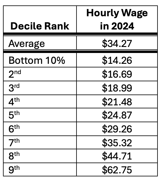
Source: Economic Policy Institute data library
So who can afford things in 2024? That’s a two-part question of: 1) How much they earn in 2024 and 2) How those earnings have grown relative to prices.
For reference, a person who worked every hour of the week every week of the year at $20 an hour would bring home just under $3500 a month, quickly outstripped by the typical monthly costs for rent ($1400), a new mortgage ($2300), utilities ($385), child care for one kid ($546-$1300), food ($830), health care ($500), and the cost of maintaining a car ($550).
In other words, the bottom earners don’t earn enough to afford these necessities, however much they’ve benefited from faster wage growth recently.
In contrast, a person who worked every hour of the week every week of the year as a top earner at $62 an hour would bring home $10,750 a month. It’s healthy enough to afford the necessities even as they become more expensive.
The real problem is that most people are in the middle, and the middle is not doing as well. Their wages aren’t high enough to overcome the high price of necessities, while at the same time necessities are becoming less, instead of more, affordable.
Putting it Together
In the next table, I compare price growth and nominal wage growth since 2001.
As you can see, college, gas, nursing homes, car repair, medical care—their prices have risen faster than anyone’s wages. Utilities for housing are not far behind them, rising faster than the wages of most earners. Meanwhile for the middle earner, their wages are barely keeping up with housing and food.
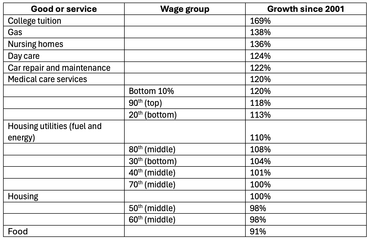
This is a table with a lot of numbers, and the numbers don’t really mean anything—what’s 91% versus 108%, really?—but consider what this table should look like. It should be that wage growth for everyone working in the economy outstrips the price of things we all need to live in the economy. But instead it shows workers, especially those in the middle, struggling to keep up.
This isn’t the full story, by any means. To start, this is just hourly earnings. It doesn’t include other sources of income, like investments, or things that aren’t income, like employer health insurance. It also doesn’t account for having two earners in a family or other factors, like if someone owns their home outright or if they are in an expensive city.
And this discusses wages for all workers; it doesn’t take into account the big gaps in earnings between workers: women make about 18% less than men, while Black and Hispanic workers make about 12% less than white workers. And it’s not as if the disparity stops there, motherhood is associated with a significant pay penalty, and moms of color experience compounded disparities. (More on this in future parts of this series.)
But, what I’ve written about here–explaining the relative growth of wages and prices–gets at the heart of what’s driving many people to feel and experience that a decent life is harder to afford in America today: the price of a decent life has shot up, while their wages haven’t.
But What About…[politician/political party I don’t like]?
Americans did not start struggling to afford a decent life in January of this year. The problem we feel at this moment was truly decades in the making. On some level, putting it this way leaves a lot of room for people who want to blame a politician or political party they don’t like. If the problem developed over a long period of time, people get to pick who in the past they blame for it.
I’m empathetic with a need to point fingers, but I can be pretty dismissive of it. What matters more is correctly diagnosing the problem in order to find the most effective solutions. And in my experience, blaming someone is just a way to give cover or provide motivation for more terrible policies.
Whatever the intentions of past leaders, this is the result. Our intention now has to be to look forward and build a version of America without this problem.
Here’s the detailed price growth chart, and I figured if you were interested in the actual nominal price growth percentages since 2001, you’d want to see since 2007 and 2019 as well. I picked 2001, 2007, and 2019 because those were peak years—just before a recession took hold. Enjoy:

For the wage growth, I'm curious about seeing a similar chart to the very last one on price increases from 2001, 2007 and 2019 but comparing wage growth during those years. I'm guessing recessions effect the wage growth quite a bit. My husband seems to think that wage suppression started happening with feminism taking hold and having more women entering the workforce, therefore leading to more supply, lower demand and lower wages (I don't agree with this as the primary factor of why wages haven't increased) but I suspect the amount of women entering the workforce isn't equal to a doubling of the workers from the 80's onward. I mean we also had large population growth! What are the biggest factors contributing to lack of wage growth?
Hi, Kathryn: I thought this was a great piece and shared it with a number of friends. One of the comments I received was about the data source, EPI. Basically, I was told that the EPI is “consistently rated as a left-leaning think tank" (which is not necessarily negative, at least to me.) I was also told that “someone from the right could probably cite data supporting a more conservative viewpoint.” What about the data question? Is there really any dispute about the facts? I'm sensitive to the subject because of all the furor around the BLS.